On this page, I’m sharing some of the small projects I’ve worked on throughout my career. Each design reflects a unique story, creative process, and the diverse needs of my clients-from music bands and mobile games to realestate. Explore the gallery to see how I approach visual identity and bring ideas to life through logo design.
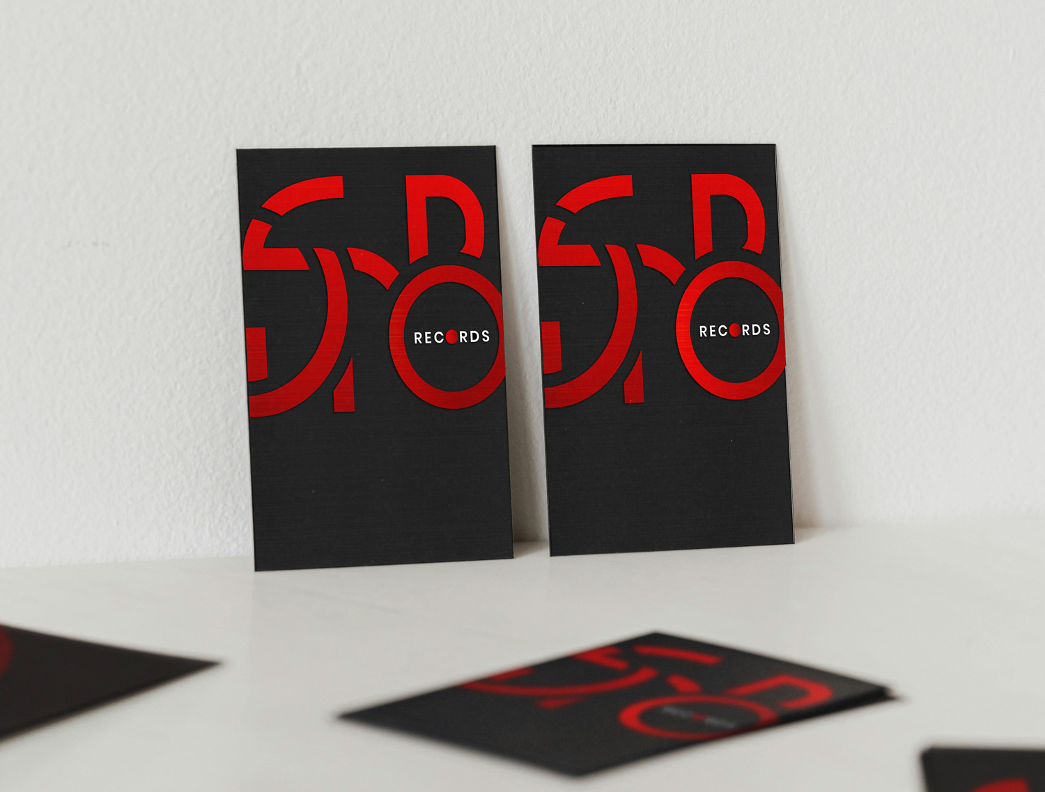
The SnobRecords logo
I designed the logo for The Snob Records client by transforming the company name into bold geometric shapes, giving it a modern and distinctive look. The standout feature is the circular “O” in “SnOb,” which doubles as a stylized vinyl record-a nod to classic music culture. The word “records” sits neatly inside this circle, while the second “O” cleverly represents the center cut of a vinyl disk. The logo uses a vibrant red on a deep black background, with the black evoking the iconic color of vinyl records and the red adding a dynamic, energetic touch.
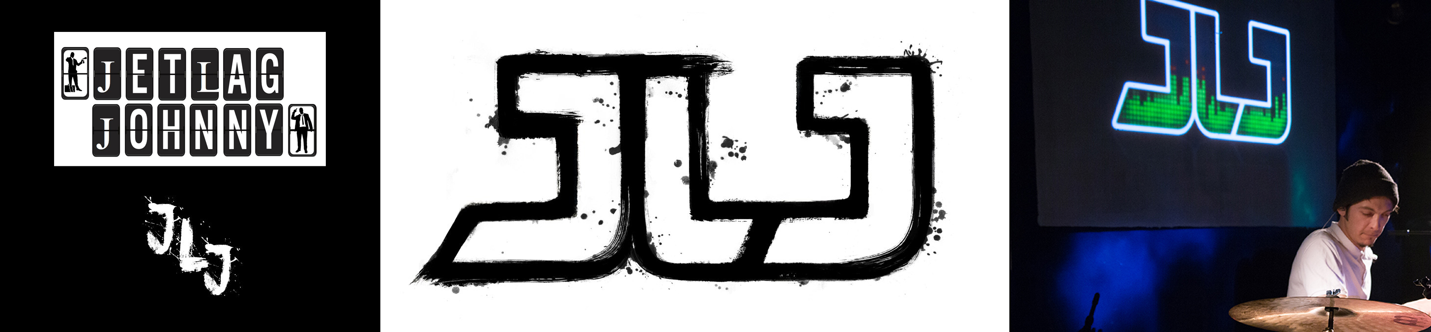
The JLJ logo
I designed a logo for the music band JLJ, who wanted two distinct versions: a stylish ink-look and a dynamic, colorful one. Since the logo features two repeating letters, using an existing font wasn’t an option-we aimed for a unique, handcrafted feel. I created the letters by hand with a brush and real ink, then scanned and traced them into vector for the ink-style version. The second version is vibrant and modern, featuring green sound waves masked within the logo letters, reminiscent of a retro disco player but with a fresh digital twist. The band uses both versions across their branding to capture different moods and contexts.
PhD covers. First cover: Acceleration of Brain Simulations
This cover visualizes the translation of biological brain processes into digital simulations. My inspiration came from the actual server hardware used for the simulations; I incorporated photos of the machine into my mockups. The illustration forms a brain shape: on the left, server cables are neatly aligned to create one half of the brain, symbolizing the structured, mechanical side of computation. On the right, the cables organically intertwine, resembling neural pathways, blood vessels, or tree roots, reflecting the complexity and connectivity of the human brain. The cover’s font is styled to mimic programming code, with color highlights on command words to emphasize the computational nature of the research.
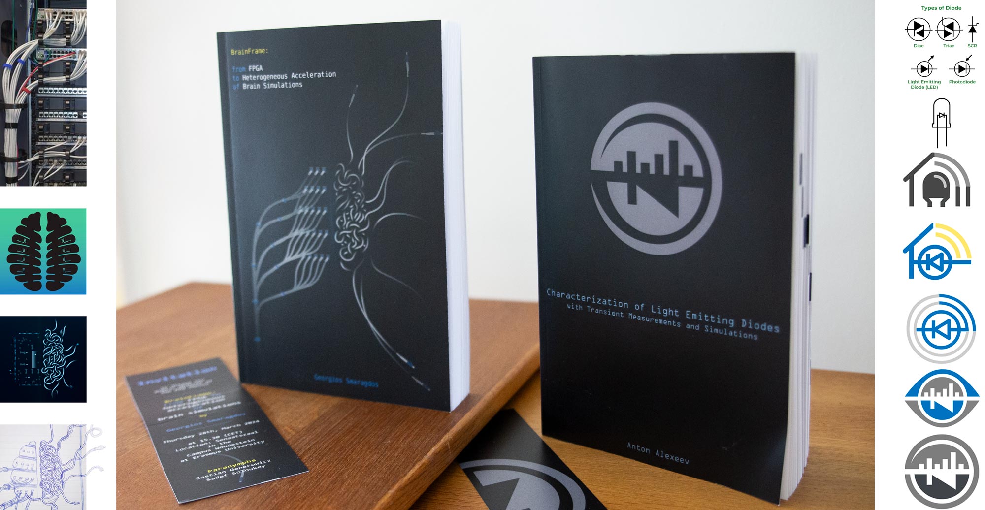
PhD covers. Second cover: Acceleration of Brain Simulations
The second cover features a design where light-emitting diodes are connected to symbols representing measurement and signal processing and visualization systems. During the design process, we considered incorporating an eye motif, but ultimately chose a simpler, round shape for clarity and focus. The client selected a monochrome palette for a clean, modern look.
Game logos
Throughout my career, I’ve created numerous logos for mobile games.
For more game logos visit my Game graphics page.
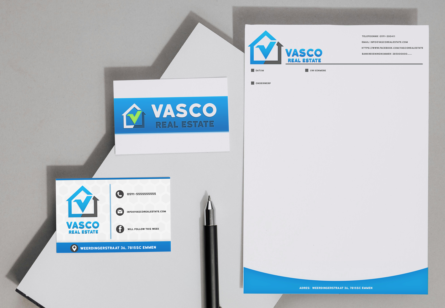
The Vasco Estate logo
In 2015, I designed the logo for Vasco Estate, a real estate company. While the design has a slightly classic look today, it effectively communicates trust and success. The logo features a house-shaped outline, resembling a checkbox, with a green checkmark inside to symbolize the right choice. The checkmark is cleverly formed from the letter “V” in “Vasco,” reinforcing the brand’s identity. One version of the logo also includes an upward-pointing arrow, using dynamic shapes to convey action and positive results. The color palette combines Vasco’s signature blue with a vibrant green accent for the checkmark. Along with the logo, I also created business cards and an email template to complete the brand’s visual identity.