Data Management Platform

Hellenic Ornithological society. Public awareness and administrative interface for wildlife poisoning incidents.

Role

UX/UI Designer

Year

2020

Client

HOS

Duration

6 months

Project briefing

The Client

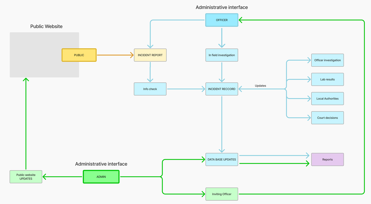
Hellenic Ornithological Society (HOS) in the process of the Life project, asked us to perform a complete redesign of the administrative interface of an online application responsible for maintaining records of poisoning incidents. These incidents are officially documented in a process that was not previously standardized. A digital protocol was created by HOS and introduced in the Balkan region to standardize and digitize the entire process.

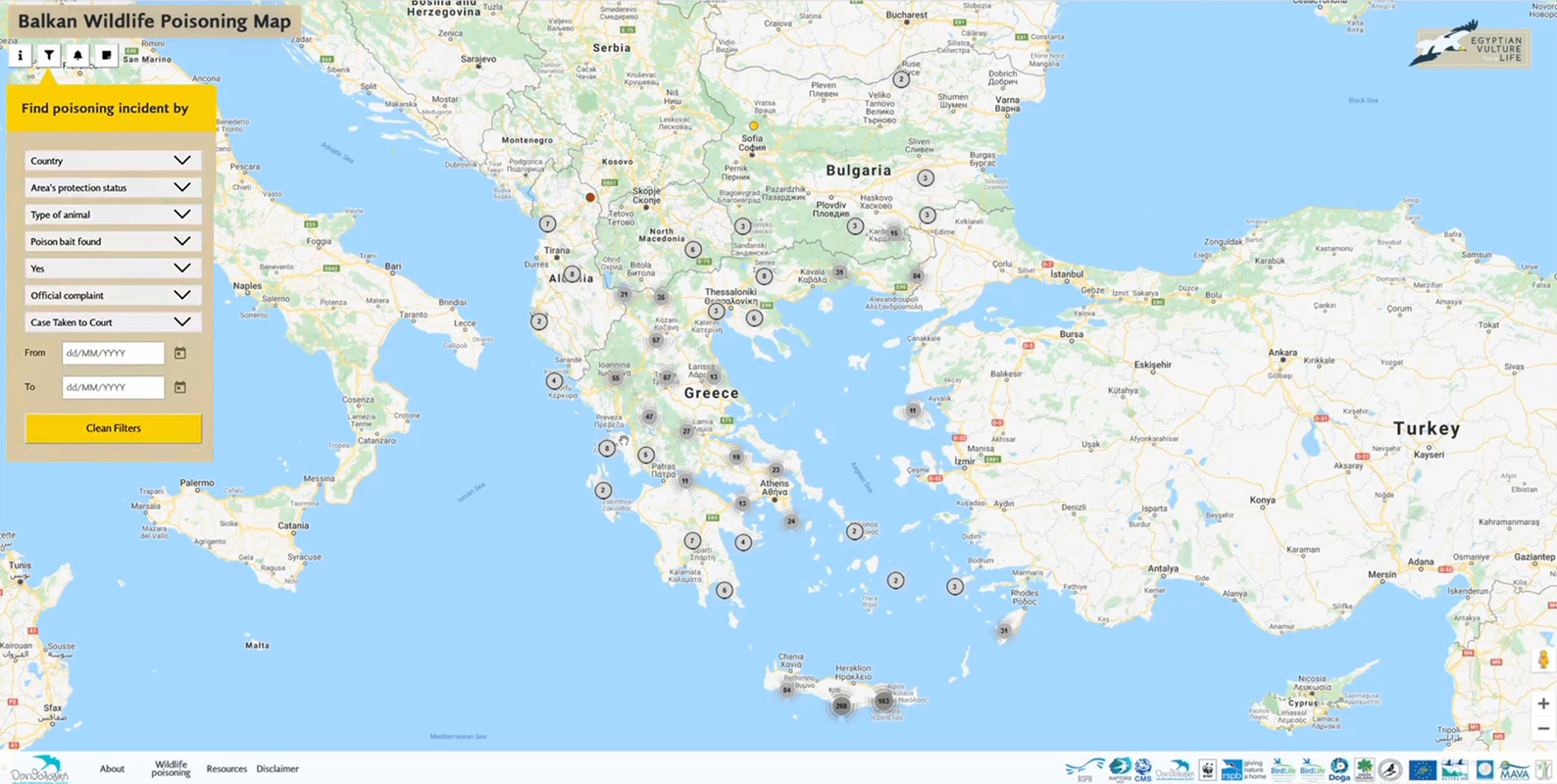
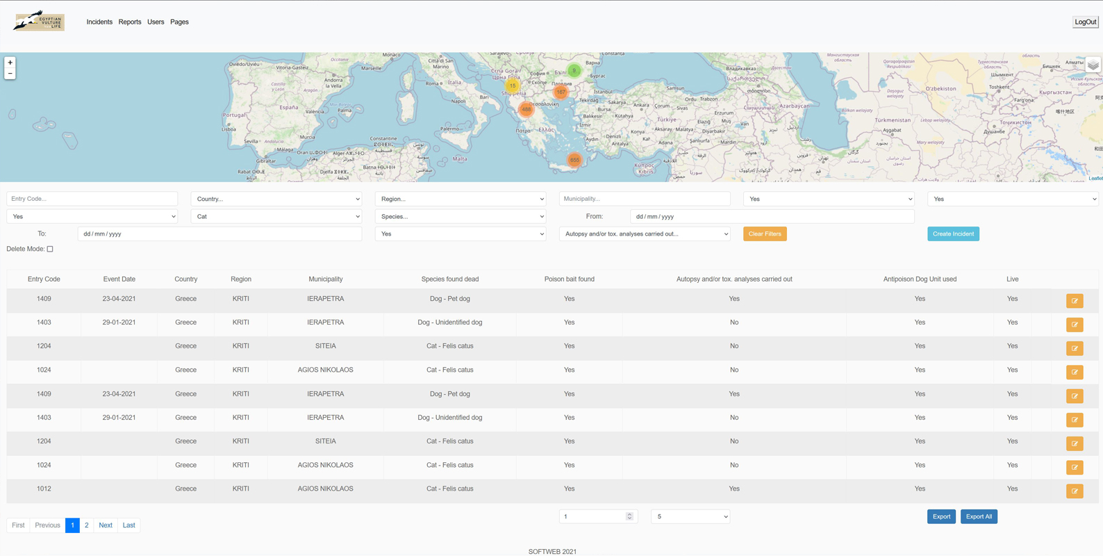
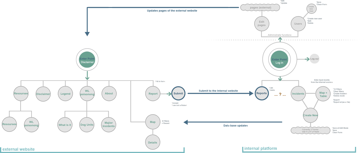
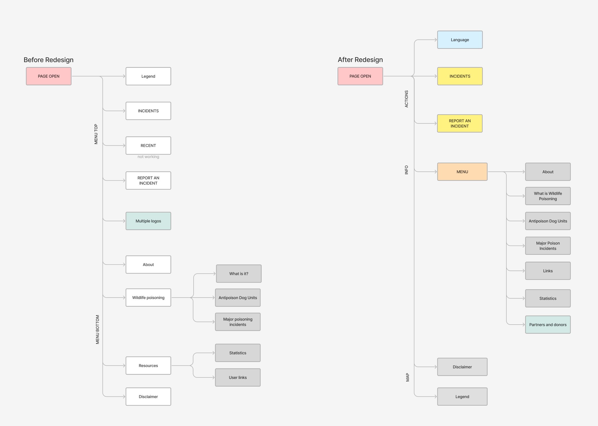
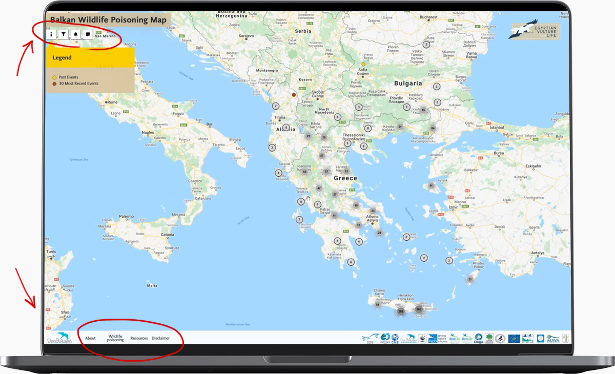
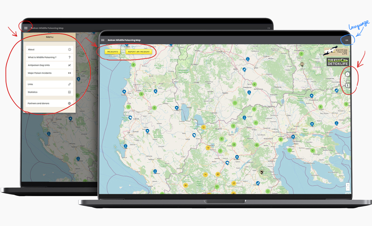
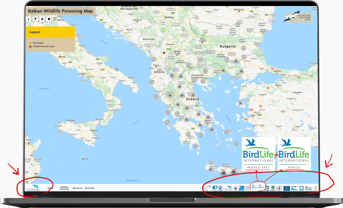
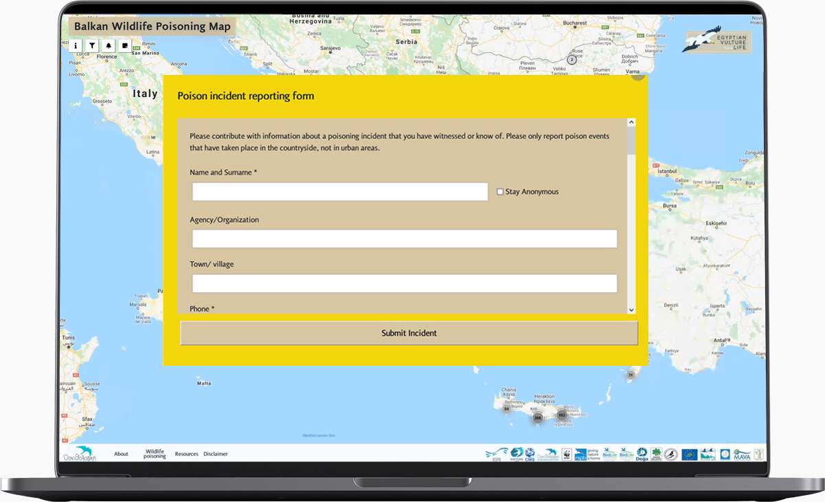
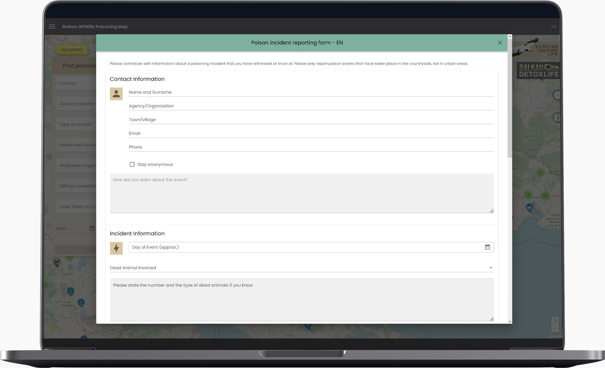
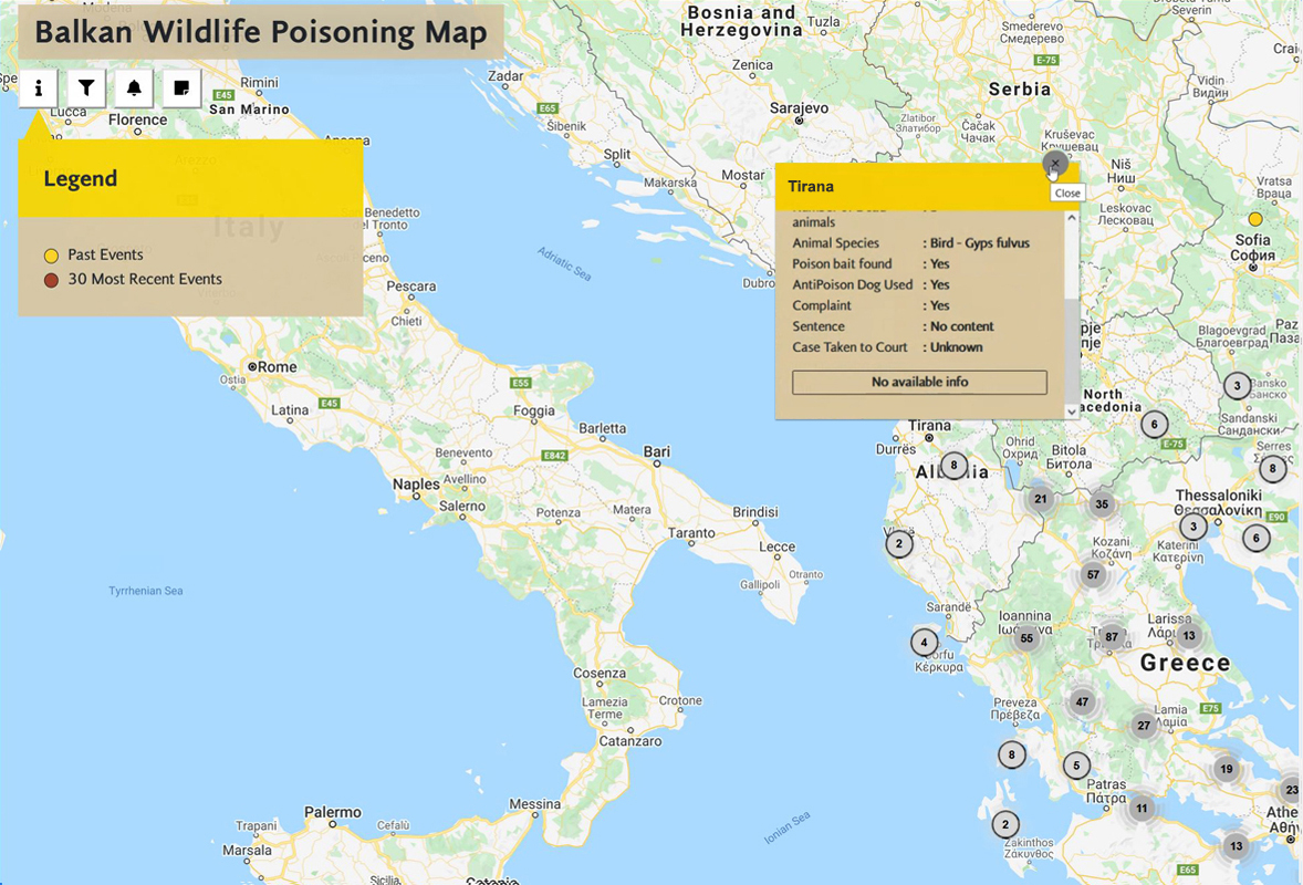
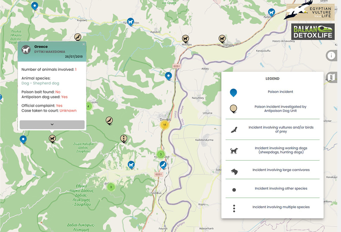
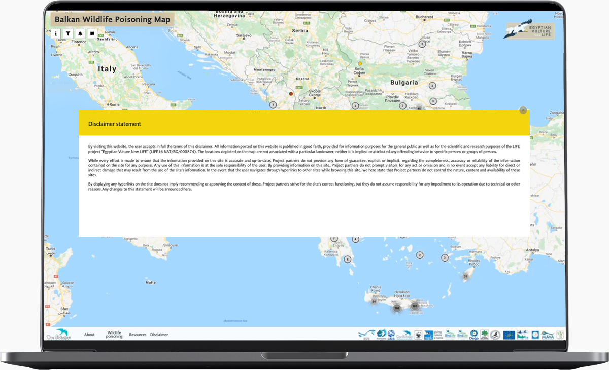
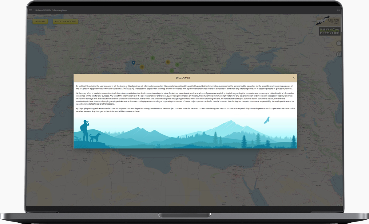
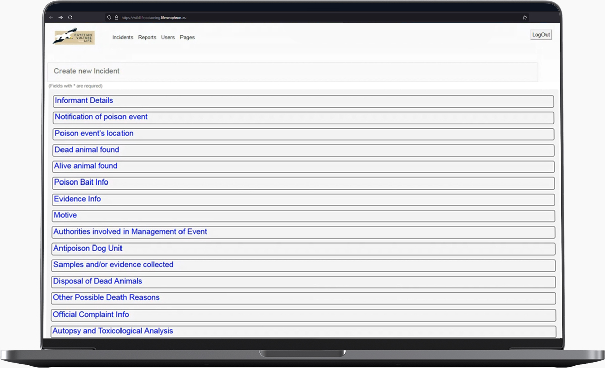
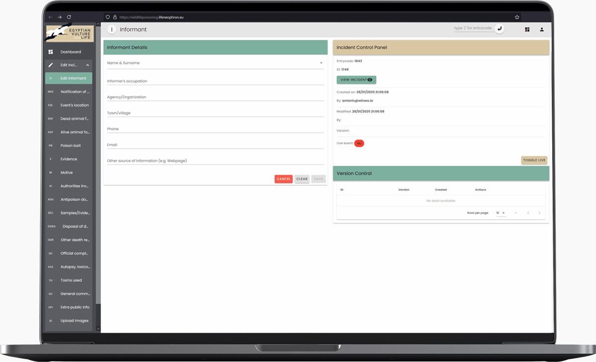
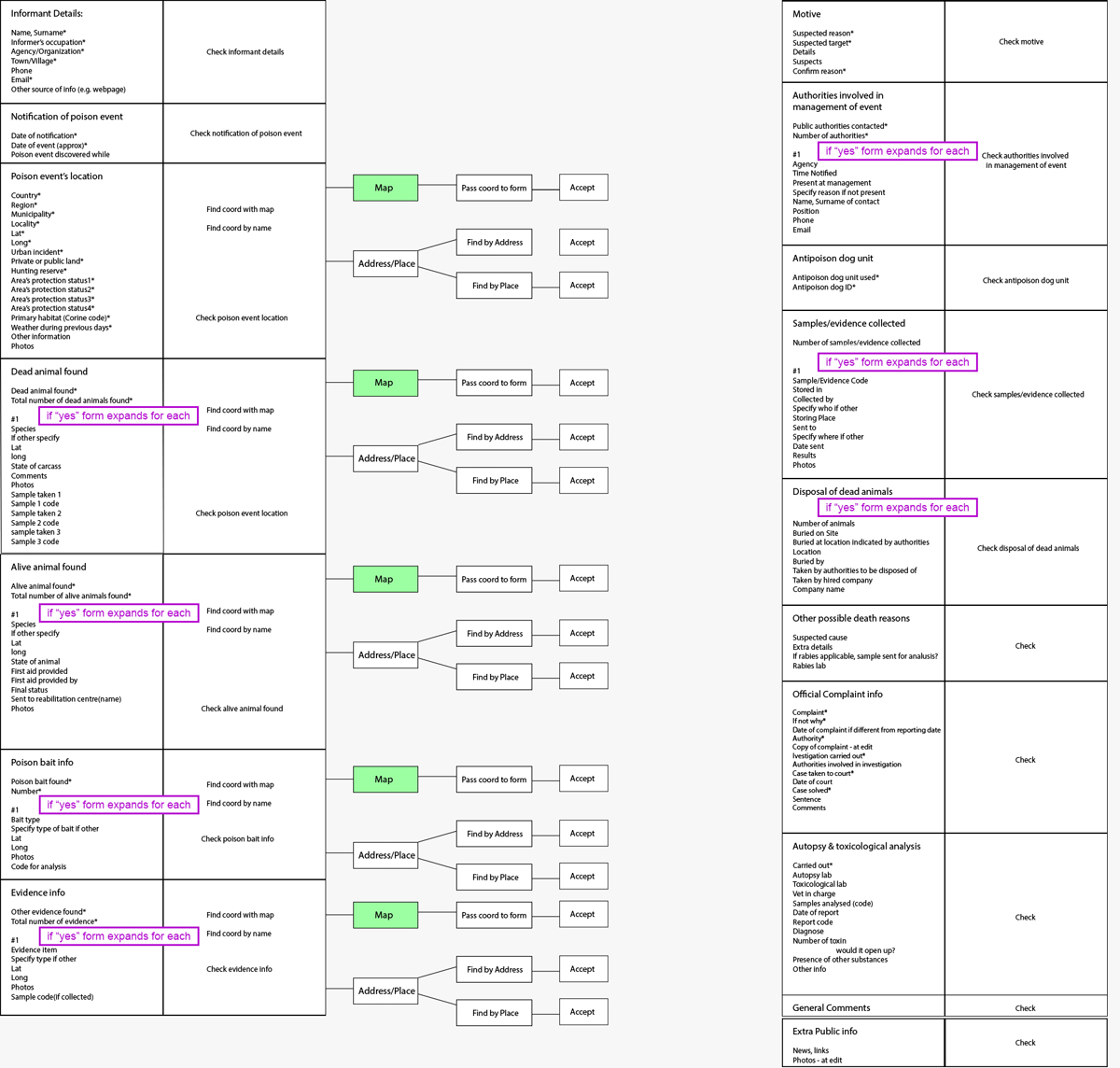
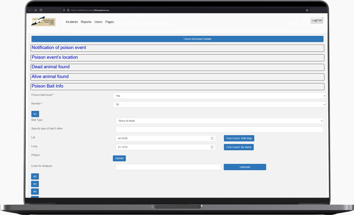
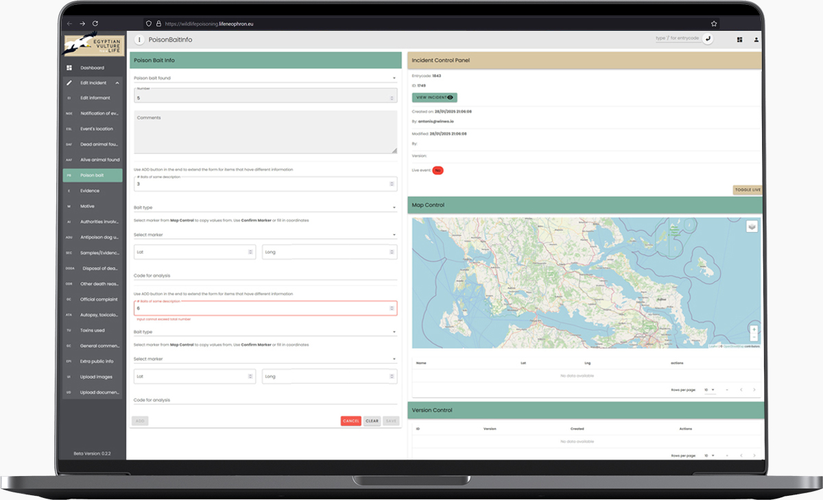
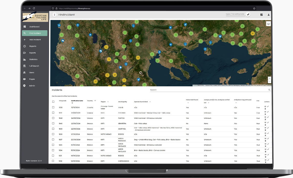
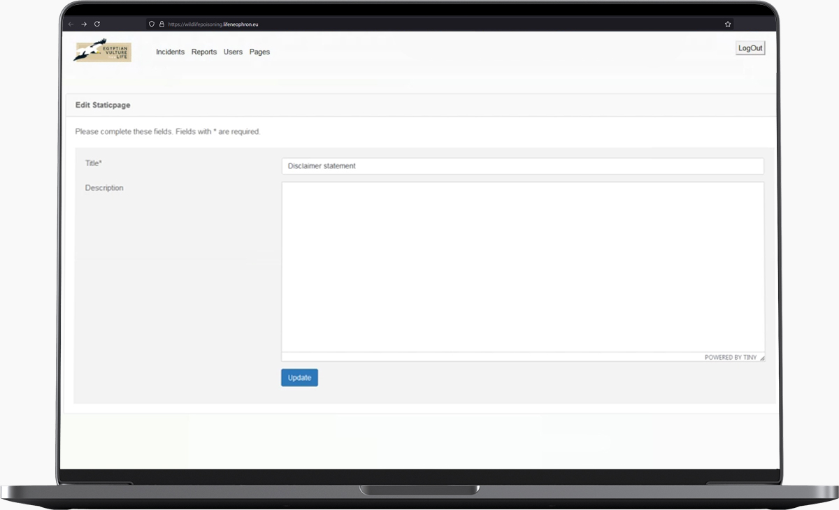
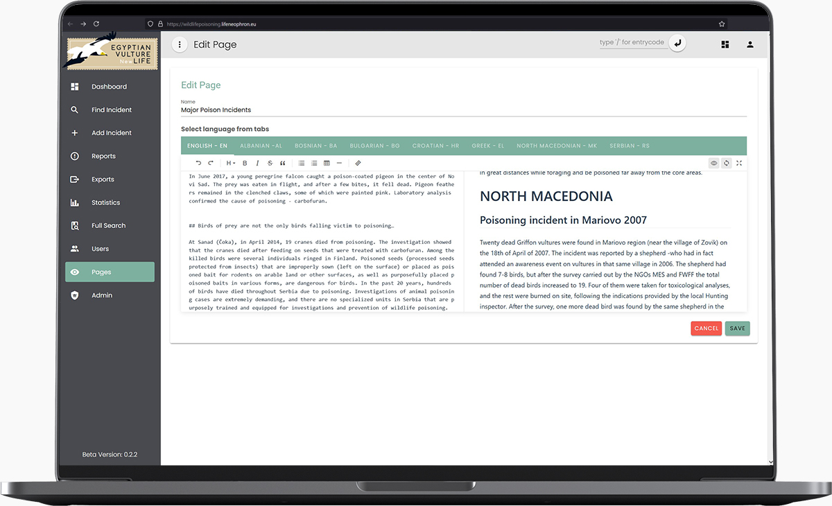
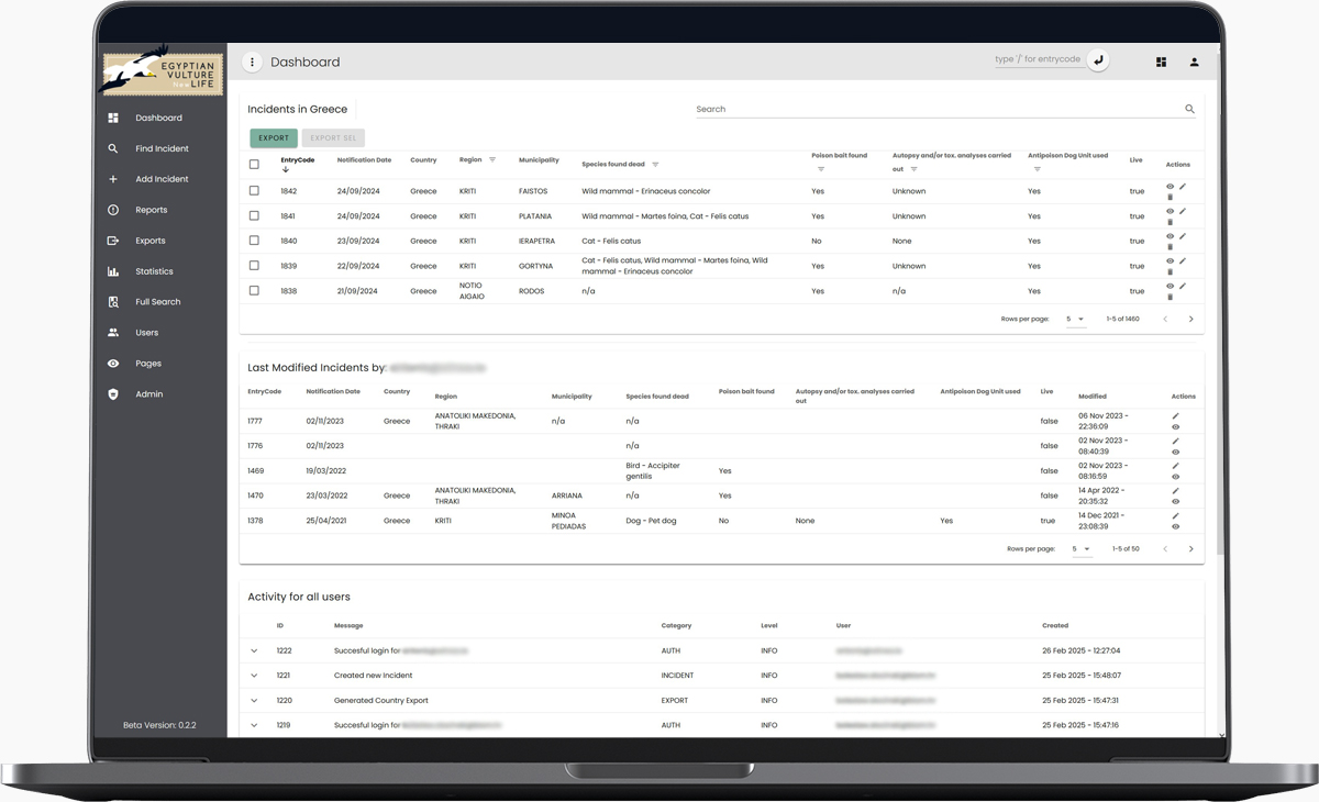
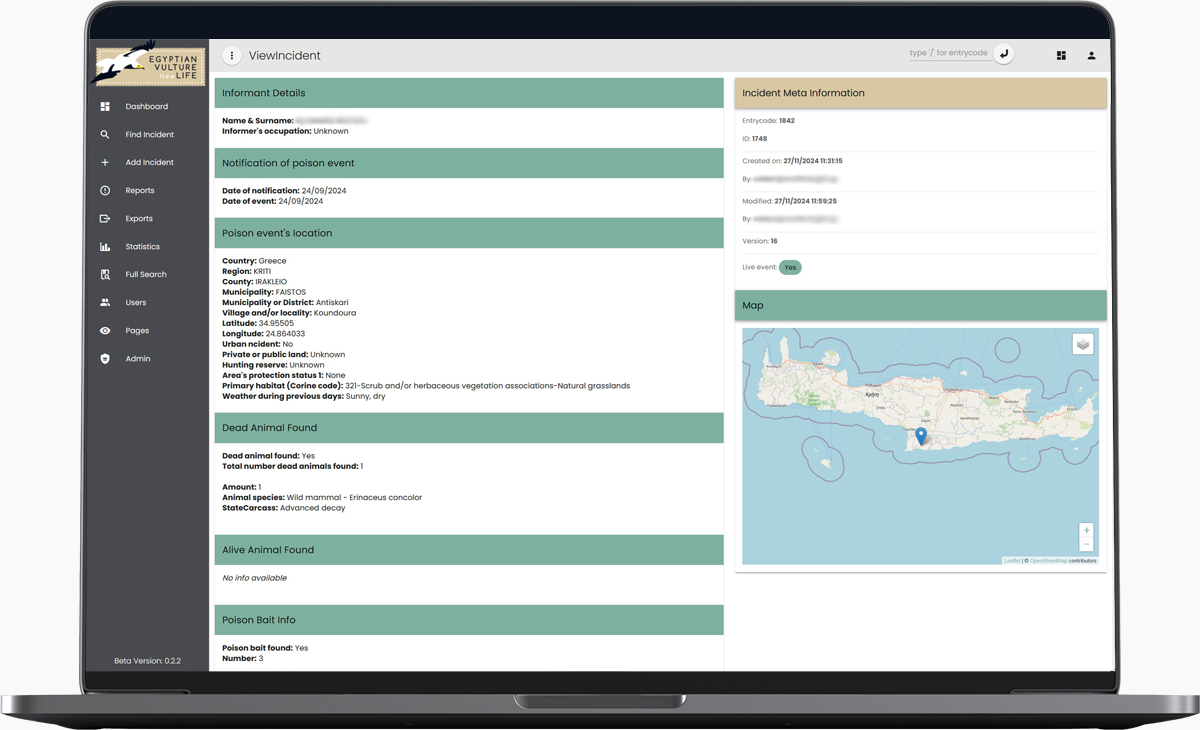
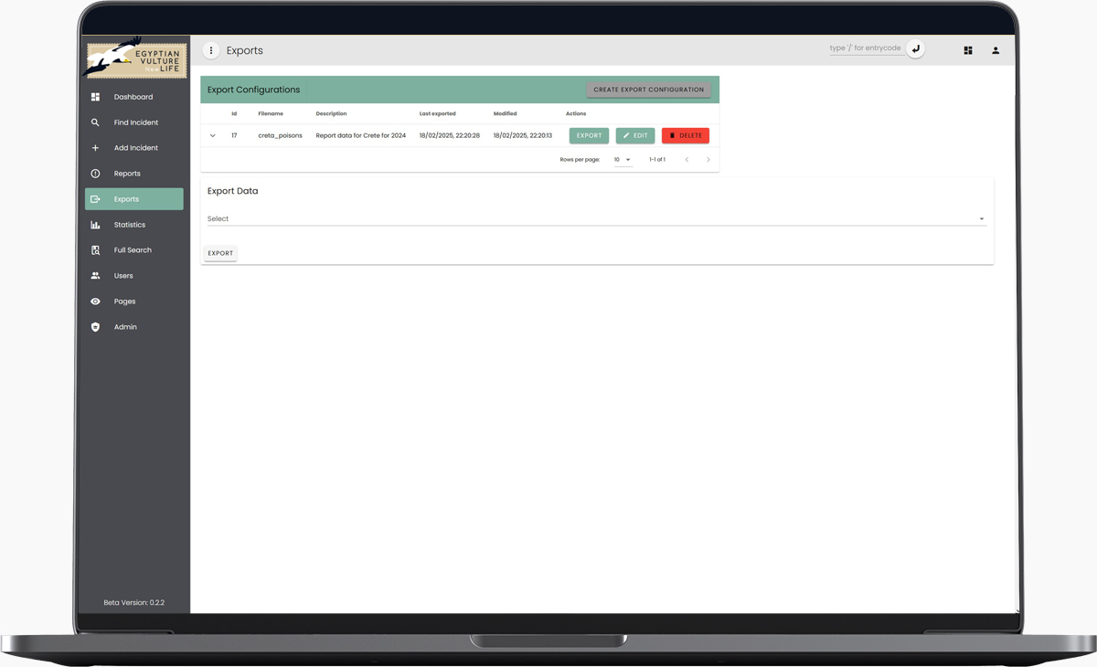
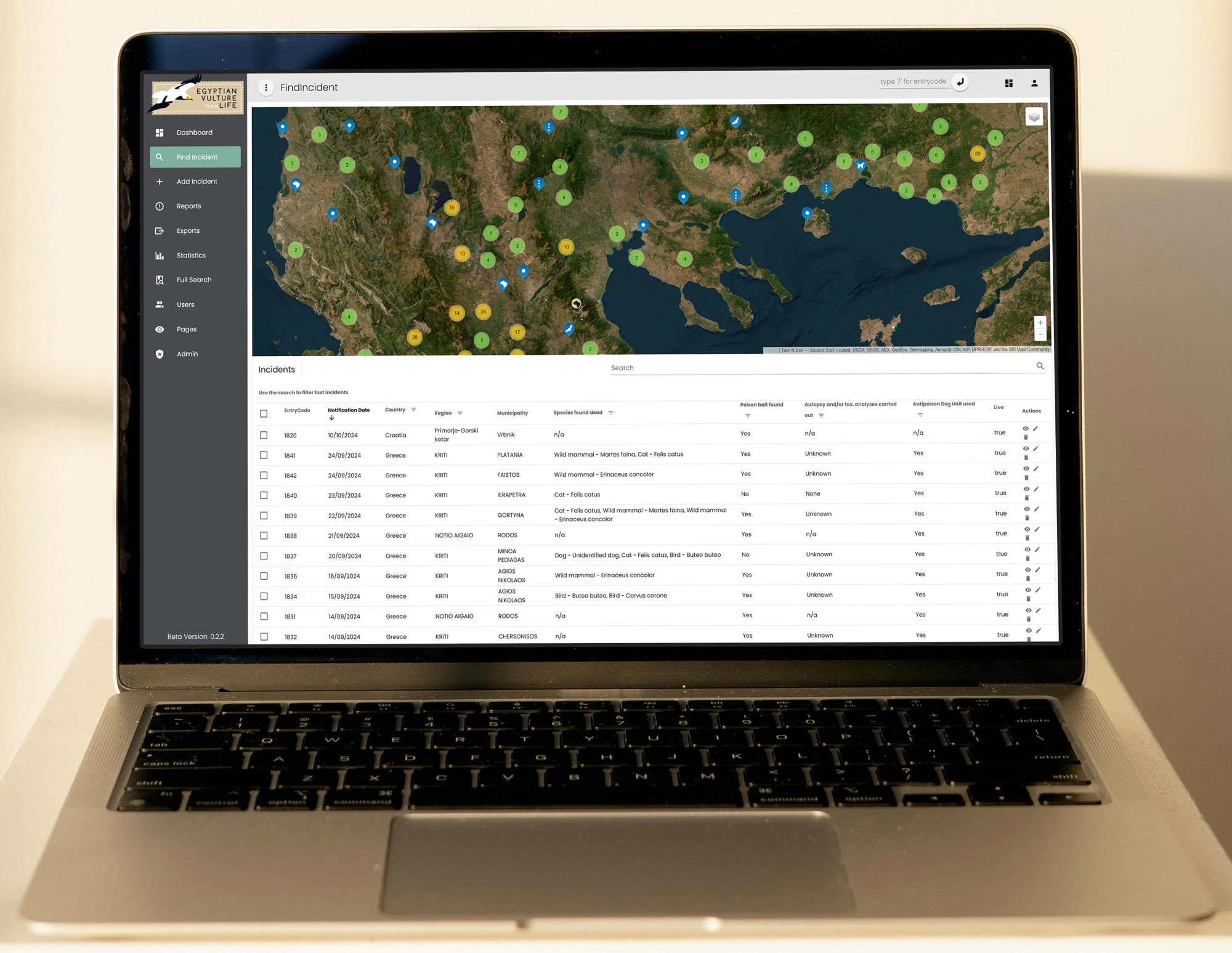
The application consisted of two parts: a publicly accessible website with an interactive map listing incidents and an administrative interface for managing the incidents database. The administrative interface was relying on an extensive series of forms, many of which is nested with interdependencies. The previous version of the interface was not supporting effectively the required activities.

Our goal was redesigning the public website while preserving the existing structure and branding. On the administrative interface we were given a list of requirements and issues.

The Project

The public website had a given branding identity and structure. We applied minimal targeted changes. Working with constraints was an extra challenge that required careful planning and communication with the client.

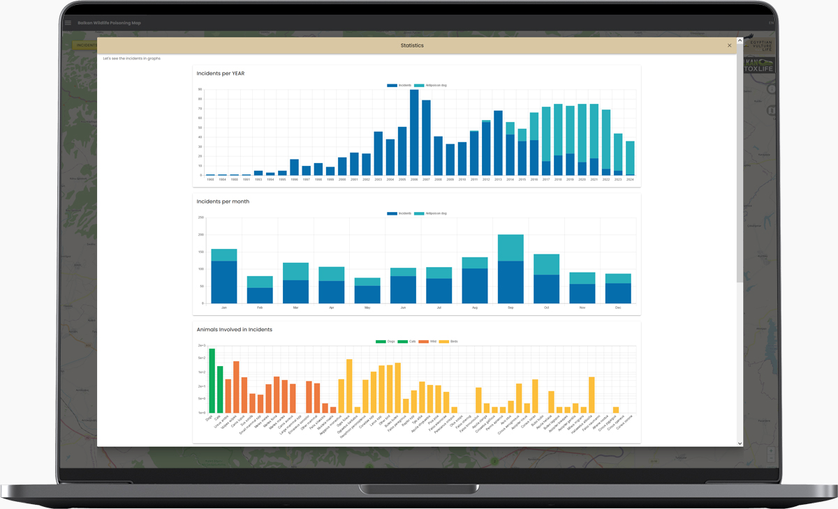
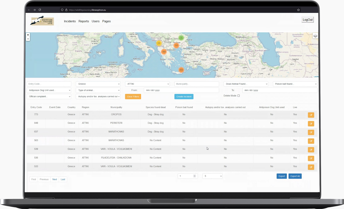
Our requirements regarding the administrative backend application were focusing on the shortcomings of the forms used for data entry. These forms were implementing the protocol but failed short guiding and providing feedback to the user. Our client experienced a number of issues in many areas such as usability, data integrity, missing information on refreshes and many more. While managing the incidents on the database, our client was relying on an extensive set of filters that were set each time they needed to find a subset of the incidents.

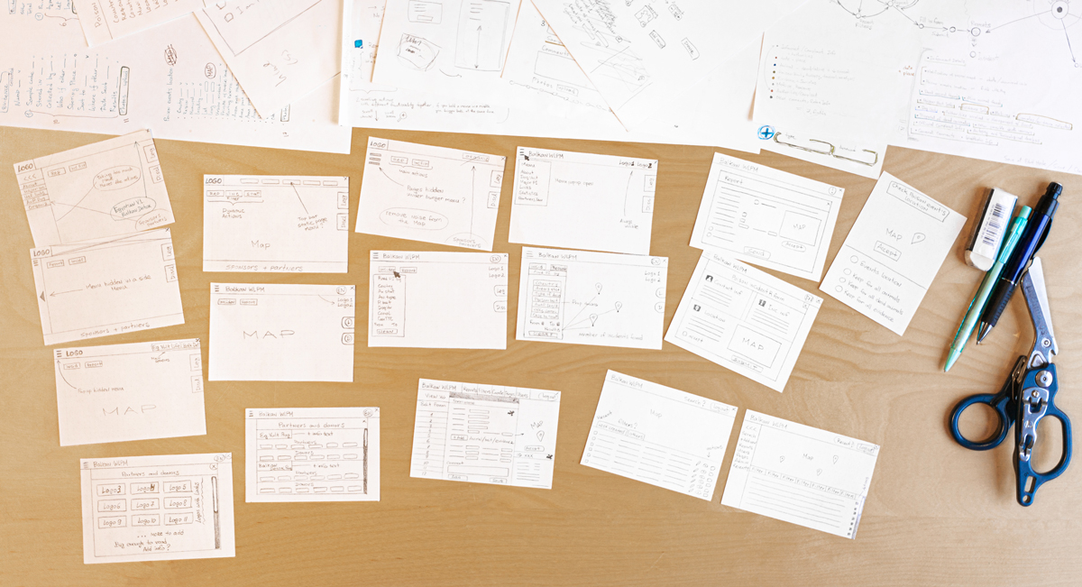
We worked closely with the client with regular sync moments and user interviews. This process enabled us to identify effectively the challenges, the user intentions and eventually implement solutions that exceeded the clients expectations.

The UX challenges I faced, included users, interactions, navigation, feedback, helping users perform complex administrative tasks, while addressing the previous negative bias of the existing application.

— I found working with an NGO a profound experience

Timeline

In the following sections we handpick some of the highligths of the project. These represent important challenges, concepts, solutions.

PRELUDE

Analysis, User Research

Question, challenge, understand, emphasize

Understanding intent and the before state

We performed interviews to understand the problems. Learned about the experience and the frustration of the user and the intent of their actions. This helped us understand the perceived complexity. After this process we noted down all the issues with all the aspects of the system.

Public website

Used by the general public

Functions:

  • Drawing attention to the issue of wildlife poisoning
  • Enable public reporting
  • Demonstrate statistics of poisoning incidents

Before

Public website before

Public website

Administrative Interface

Used by officers and coordinators from multiple organizations in the Balkan region. The intent of the system includes the points below.

Functions:

  • Unified database integration from 7 Balkan countries
  • Incident and investigation database
  • Multiple coordinator access
  • Different access levels between user roles
  • Pattern recognition for wildlife poisoning cases
  • Animal population tracking and impact assessment
  • Legal precedent and know-how sharing
  • Educational tactics evaluation
  • Interactive mapping for field navigation
  • Data analysis and infographic generation for reporting

Before

Administrate interface - before state

Administrative interface

Schema

Visualization of entities and interaction between database and backend functionalities with public website.

We were upgrading an existing application so understanding the limitations the users were experiencing was critical to our success. Incident protocol requires a very extensive form submission system, with nested forms and need for validation and guidance for the users. Preview of submission and incidents was not available, feedback to user was lacking.

User Research and Investigation

To gain a comprehensive understanding of the challenges faced by users of the Balkan Wildlife Poison Map platform, I conducted a series of in-depth user interviews and usability tests. These sessions were carried out via Zoom calls, allowing for real-time observation and interaction with users across different Balkan countries.

The research process involved:

  • Semi-structured interviews with officers and coordinators
  • Task-based usability testing of the internal platform
  • Analysis of user workflows and pain points
  • Examination of existing documentation and user feedback
Working process

Working process.

This comprehensive approach allowed me to identify key usability issues, understand user goals and motivations, and uncover opportunities for improvement. The findings from these sessions formed the basis for the UX challenges and proposed solutions outlined below.

PART ONE

Public Website

Challenge: Redesign under constraints

(Re)design process

Improving UX and look and feel, without rebranding

Pre analysis abstract

Business Perspective

Goals:

  • Collect wildlife poisoning reports
  • Increase public awareness
  • Educate about wildlife protection

Problems:

  • Widespread wildlife poisoning
  • Low public awareness
  • Limited resources and funding
  • Insufficient data collection

User Perspective

Goals:

  • Find information easily
  • Report incidents quickly
  • Contribute to conservation
  • Understand their impact

Problems:

  • Time constraints
  • Lack of interest or knowledge
  • Misinformation
  • Difficulty in seeing tangible results

Actions

  • Simplify reporting process
  • Create clear, engaging content
  • Implement user-friendly design
  • Show real-time impact of user contributions

Selection of challenges and improvements

Throughout the design process we performed a series of actions to improve the overall look and feel of the application. The following are some representative challenges and the impact we managed to bring to the application.

Navigation schemas before and after

Navigation schemas before and after.

Information Architecture

Before

Public menu before

After

Public menu after

Challenges

Menu structure leading to navigation difficulties and cognitive load.
Poor positioning of frequently used buttons (Search and Report).
Language selection option hidden within menu elements.
Unclear positioning of map elements (Disclaimer and Legend).

Solutions

Redesigned the website navigation for improved user flow.
Consolidated additional information pages under a single Menu for streamlined access.
Repositioned Search Incidents and Report action buttons prominently on the main screen.
Added a language selection option to the top bar for improved accessibility.
Relocated Disclaimer and Legend to the right side of the map, adhering to common map design practices.

Sponsor Visibility

Before

Sponsors before

After

Sponsors after

Inconsistent and unclear presentation of partner logos.

The older version is displaying them on a footer. This solution is not scalable and the logos are not readable. This is especially critical for global organizations that have regional offices, making them indistinguisable in a compressed footer layout.

I designed a dedicated page for partners and donors to accommodate detailed collaborations and organizational info. It allowed us to show partners and donors of both sponsors in a readable and scalable way.

Incident Report Form

Before

After

Unexpected form expansion (from 8 to 16 fields), Lack of logical field grouping, Unclear form extent, too many mandatory fields.

Impact

Upfront display of all fields
Intuitive field categorization and styling
Reduced mandatory fields based on stakeholder input

These improvements decreased user frustration and helped to increase the amount of finalized reports.

Interactive Map, Legend and Markers

Before

External map legend before

After

External map legend after

Different categories of map tags were discussed and tested.

Lack of visual differentiation between map markers and info cards
Poor readability of incident detail cards
Presence of irrelevant information in detail cards
Introduced icons representing incident type
Grouped text fields and added color accents for improved readability
Removed extraneous information to focus on essential data

These improvements significantly enhanced the map's usability, reduced cognitive load for officers, and streamlined the process of identifying and analyzing incidents.

Data Visualization and Typography Enhancement

Before

Disclaimer page before

After

Disclaimer page after

Challenge

The existing content pages suffered from a lack of visual hierarchy and engagement due to flat, unstructured text. This issue was compounded by the limitations of the built-in text editor in the internal platform, which restricted dynamic content styling options.

Solution

I created a series of custom vector illustrations to complement the textual content. Illustrations depict key aspects of wildlife conservation work:
  • A day in the life of an officer with an anti-poison dog unit
  • Representations of endangered species relevant to the project

Impact

Placing images strategically throughout the content supported better information retention and increased user engagement. This approach helped to break up text-heavy sections and provide visual anchors for key information.

Statistics Dashboard

Before

Disclaimer page before

After

Public statistics

Challenge

Create an intuitive, visually appealing statistics page to showcase the scale of wildlife poisoning incidents and support management reporting. The goal was to improve user engagement and serve as a powerful tool for stakeholders to understand, communicate, and act upon the critical issue of wildlife poisoning in the Balkans.

Research and Planning

During interviews, I identified key incident metrics to be extracted and displayed as statistical widgets from the data platform.

Implementation

Selected widgets from a design framework, customized widget colors to align with our design guidelines, ensuring consistency across the website and platform.

Responsive Design

Optimized widget layouts for various screen sizes to maintain readability on both desktop and mobile devices.

PART TWO

Administrative Interface

Data management, datatables, forms, redesign

Design from scratch

Overall we rethough the complete UX process for the administrative interface. We implemented dashboards, statistics, multiple datatable views on the database. The data entry process was rebuilt from the ground up with new forms, feedback and UX improvements.

Pre analysis abstract

Business Perspective

Goals:

  • Centralize data across 7 Balkan countries
  • Enhance cross-border coordination
  • Streamline wildlife poisoning incident management
  • Ensure data integrity and backup
  • Unify conservation efforts

Problems:

  • Slow database performance
  • Information overload and complex data management
  • Inconsistent incident documentation methods
  • Limited exproting capabilities
  • Insufficient data analysis

User Perspective

Goals:

  • Simplify incident reporting and documentation
  • Access comprehensive incident information quickly
  • Collaborate effectively across borders
  • Visualize data for better decision-making

Problems:

  • Overwhelming number of form fields
  • No tracking of previous actions
  • Lack of visual indication for new incidents
  • Inefficient data entry for multiple items
  • Complex filtering system
  • Limited map functionality for field navigation
  • No incident page preview
  • No administrative actions, delete, undo/redo
  • No persistent changes till user saves forms

Actions

  • Optimize database performance
  • Redesign incident reporting forms
  • Implement user-friendly filtering and search
  • Enhance map functionality
  • Create comprehensive onboarding program
  • Create exporting configurations
  • Provide incident preview and metadata views
Flow insights

Flow insights.

UX challenges selection of Administrative Interface

Before

After

Streamlining Information Structure

The initial design featured a lengthy list of expandable sub-forms filled with input fields. During data entry, users had to constantly navigate through collapsable forms. They only way to see filled-in content was to explicitly open all of the forms for each of the categories. This lead to endless clicking and scrolling. Users expressed their wish for a better way of viewing the filled in information.

We created a series of separate forms for each of the categories of the protocol. A new preview state for the incident is directly accessible via the control sidebar on the right. The preview incident page, allows for direct navigation to the required edit form with a single click.

In game graphic

An impression on subforms

Enhancing UX for Multiple Inputs 1/2

Another significant challenge was improving the user experience for common scenarios involving multiple poisoned animals, bait types, and other evidence. In these cases, users were required to input a lot of information for each entry, such as location tags. As the number of items could exceed 50 for each type — the number of sub-forms grew expotentially.

Before

After

Enhancing UX for Multiple Inputs 1/2

To address this, we introduced a feature that allowed users to group related items together. Instead of filling in each individual animal, bait, or piece of evidence separately, users could now input details for entire groups. For example, the form allows users to specify the total number of animals and then break it down by type or group. To prevent errors, we included form validation to ensure that the number of animals in a group never exceeded the total number specified. This approach was applied consistently across all sub-forms, significantly improving the overall experience without sacrificing data accuracy.

Through these thoughtful design decisions, we have transformed an overwhelming reporting process into an efficient and user-friendly experience.

Before

After

Incident Datatable and filters

The previous version was full of custom filters that would reset on every page refresh. The provided markers did not provide any functionality.

The markers in the new version, allow direct navigation to the incident preview page. When using the filters, the operation is applied dynamically in the data collection.

The main exporting functionality that was performed via these filters in the previous state, was completely redesigned in the export configuration page.

Before

After

Content Page Editor

The previous version was providing limited abilities to edit the content of the pages present in the public website. There was no support to perform the multilingual edits required for the seven countries involved in the program.

We provided an editor with a live preview of the changes. The content can be expressed using Markdown to keep the complexity low, and a live preview is directly presented side-by-side to allow people with limited Markdown experience to see what they do. Multiple tabs are present to facilitate each language.

Before

After

Login Screen UI

We provided a new login screen with an updated UI. The focus was on providing a more pleasing experience and follow the same visual and aesthetics throughout the application.

Before

After

Dashboard Datatables

After login, we land on the Dashboard that is presenting a fast access datatables. Last incidents, last modified and a country specific to the user overview is provided.

Consulting with the user, we prioritized a data interface towards the data and actions that are more frequently performed by the users. Each user has a country setting, therefore their specific country information is prioritized. The last modified, provides direct insights to the user's own changes for review, inspection, updates, since these are the access patterns we identified during interviews. FIXME

Before

After

Incident Preview

In the previous version, the only way to see the data contained within the incidents, was to open up the forms. This introduced navigation overhead, the risk of making accidental changes, and no ability for fast inspection of the overall status, since each form had to be individually opened.

We introduced the Incident Preview page where all the information of the incident is presented in the same logical structure as the forms themselves. We can now scroll through the incident information and if we wish, a single click in the relevant block, will take us to the edit form for the specific information block.

On the same time, on the rightmost sidebar, we always see the metadata information for the given incident.

Before

After

Export Configuration

One of the most requested functionalities was to allow the user to export a selection of incidents. This selection was almost entirely the result of a filter operation based on common filters.

After consulting with the customer, we concluded that these exports can serve different business purposes and oftentimes a data manager would fiddle around with filters to create the required dataset for a specific report. This exact dataset would be needed in the future as well.

We introduced the concept of an Export Configuration where the users can apply the filtering operations they need, and then store this selection in a specific configuration. This configuration contains additional metadata that can facilitate future needs and requirements. When a configuration is created, the export report will contain all incidents in the system that match the selection criteria.

PART THREE

Leasons Learned

Results, skills, tools, insights

Conclusions

Data and protocols subject to UX

Conservation efforts often depend on complicated workflows. These workflows and protocols are important for the scientific validation and demonstration of the issues that conservations face.

In all our communications with the people of the Hellenic Ornithological Society it was clearly abundant how they care about the mission and the impact we can achieve. The challenges they face on translating their requirements into an application with a refined experience is profound.

We were happy to demonstrate what are the great effects of UX in what looked initially as a book keeping operation. We successfully transformed our users experience to more effectively use and track the evolution of the protocol and incidents across the Balkan region.

— I hope this contributes to raising public awareness on the effects of poisons in wildlife and conservation

Tasks

  • User Research
  • Plan the project workflow
  • Create conceptual models
  • Sketch and ideate
  • Develop wireframes
  • Create user flows
  • Design visual mockups
  • Iterate and refine
  • Design visual mockups
  • Post-launch evaluation

Tools

  • Figma
  • Material Design
  • Vue.js
  • Vuetify
  • Agile Development
  • Gitlab
  • VSCode